In today’s lesson of Writing for Comics 101, let’s talk about making pages you can ACTUALLY read.
How do we do that? By not packing the pages with an obscene amount of dialogue.
Or at least, if you HAVE to keep so much dialogue, how to pace it out so it’s not a word brick.
This technique is something discussed in more detail in Making Comics by Scott McCloud, so what I’ll do for today’s post is share my mistakes so you can learn from them.
Let’s take a look at this page from Seeing Him, written by Kia Crawford and drawn by me:
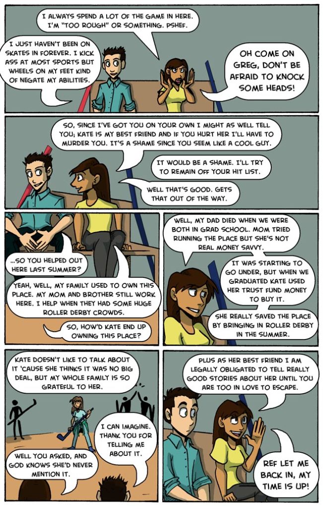
To be honest, there’s a way to get the information across that we need, without using a fuck-ton of dialogue.
We could:
- split this between two pages,
- condense the banter,
- condense the backstory drop,
- change the page layout,
- change the balloon layout,
- or any combination of these.
At least past me had the sense to split the dialogue into separate balloons. That way the page felt, at the time, a little less like a word brick.
This is me spit-balling some ideas right now on how to fix this page of Seeing Him: we could change the camera focus in the second and third panels, to cut away to framed photos on the walls. Those photos could showcase the history of the venue. With that edit, we can split the dialogue up some more, re-frame where the speech balloons sit, and make the page feel like less of a collection of talking heads.
Compare this page to The Legend of Jamie Roberts, page 65, written and drawn by me.
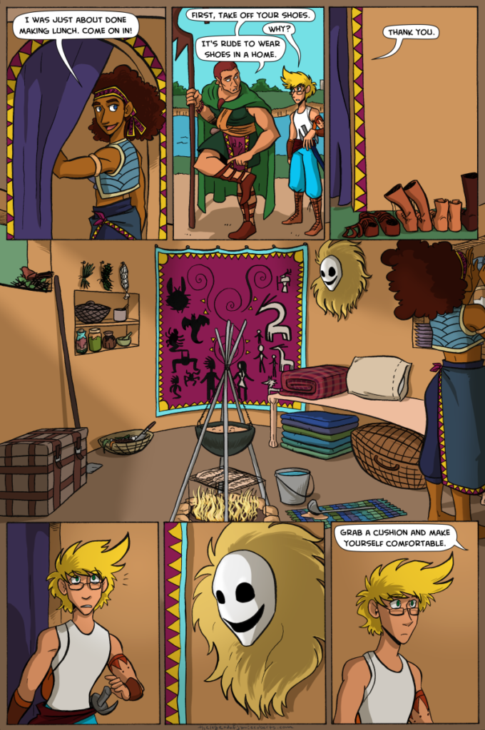
Here, I let the space breathe and tell the story for me, without so many words.
Whether you can draw or not, comics are a visual medium. Let the environment and scenery describe for you what words could not.
If you have questions, or need feedback, let me know in the comments. I’m happy to help.
That’s all for now. Thank you for reading!
You. Are. Awesome.
