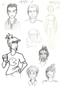
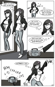
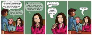
My Recent Works-In-Progress

Man, between all the blog posts, Validation comics, Johnson & Sir comics, freelance work, and the day job (yep, I got a day job) keeping me busy, do I have time for personal projects?

Yes. Yes I do!

Project 1 is very different from what I usually do. Project 1 is a large acrylic painting.

acrylic painting work in progress by kelci d
Step 1.
painting work in progress
Step 2.

By “large,” I mean it’s larger than my usual scale. I’m used to working on, at most, 9 inch by 12 inch pieces of paper. This is 16 inches by 20 inches on canvas.

This is a painting that my mind demanded I make, because there are lighting techniques I want to try with this.

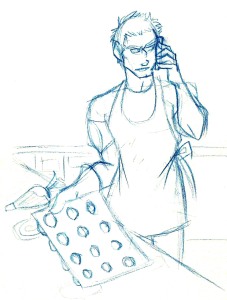
Project 2 is connected to Validation. It’s a portrait of one of my favorite characters ever…

Roxie.

roxie colored pencil personal project

This is a piece I’m doing in colored pencil, which I haven’t used in years. It’s a good refresher to brush up on my old skills. I’m also doing my best to use colors in ways I haven’t before. I’ll post more pictures as I work on it.

Project 3 is a comic I’m hoping to get out by October. I’ve mentioned it a few times previously here on the blog.

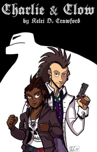
It’s Charlie & Clow.

charlie and clow cover

The cover is done and I’m so happy with how it turned out! I need to make the next few pages and take care of a few other things. With any luck it should be online by Halloween.

The story is about a young punk lady named Charlie. When she’s walking home from classes one day, she discovers a monstrous golem, and it decides Charlie will be its next meal! Charlie runs for help only to find a tall goth man who calls himself Clow. Who is Clow? And will he help her fight off the golem menace?

Of course, there are other projects I have in the works, but they’re all either very personal or top secret surprises. So I won’t say any more.

Which project are you most excited to see? Do you have any personal projects in the works? Let me know in the comments!

Also, I’m skipping the Favorite Artist Friday feature this week because I’m still scouring the internet for new artists to add as my favorites. If you have any suggestions for artists I should look at, let me know in the comments!

Thank you for reading, and I’ll see you on Tuesday.

Review Day Tuesday: Bartez

bartez book cover

Bartez is a comic I found at Intervention Con, mostly because the author, Ryan, was right across the aisle from me. I never heard of the project before that weekend, so I bought a copy of the book. Once the convention madness died down, I finally sat down to read it.

And you know what? I like it.

Is it life-altering? No. Is it fun? Yes, and delightfully silly to boot.

The story follows Jimmy Barton, an average guy who works in IT, who still hangs out with a lot of his old high school buddies, and lives in the town he’s always grown up in. He’s also a bit of a quitter – he tries new things, but he never sticks to them for very long. Tae Kwon Do? Wrestling? Parkour? Nope, nope, and nope.

That is, until he discovers one of his old friends was murdered by a rogue member of a secret society. And now, Jimmy might be next on the murderer’s hit list! Will he be able to actually stick to something and learn how to save himself?

The book I read is the first volume in a series, but I don’t know how long the series will be. It’s a series I want to read, though! Now let me tell you why.

bartez by ryan peraro and gale williams

bartez by ryan peraro and gale williams

The art, which seems (very) influenced by the likes of Bryan Lee O’Malley and Vera Brosgol, is sharp, clean, and easy to read. In an art style like this it can be easy to make the characters look alike. Thankfully, the artist (Gale Williams) does a wonderful job creating unique character visuals. I could tell Jimmy apart from his friends, and even the ladies look varied and stylized.

The action scenes are sporadic, but are drawn very well. I look forward to seeing what future action scenes in later volumes will look like!

The writing is, at the start, slow. The writer definitely takes his time developing the characters and scenarios, which isn’t a bad thing. I appreciate the slowness a bit because in too many comics nowadays people are rushing to get to the action. In Bartez you’re supposed to see what life is like before things get crazy. And Ryan Peraro does a great job showing everyday situations.

Once things start getting crazy, Ryan has built up the characters and the scenario enough that you believe what happens in the story. It’s actually pretty brilliant.

And you know what? The art and the writing work fantastically together in this comic. There are two creators on the project but it feels like one unified voice. That, to me, is wonderful.

If you want to read Bartez, they have the comic online and in print. My vote? It’s worth the $10 to get the first volume.

Have you found any comics worth reading? Did you read Bartez? Let me know in the comments!

Thank you for reading, and I’ll see you tomorrow with new artwork.

Intervention Con in Ten Points or Less


intervention con hotel 2014

From August 22 to the 24, I was at Rockville, MD for Intervention Con!

It was my first time at this particular convention (and my first time in Maryland, really). It was a get-together to celebrate webcomics, gaming, and an awful lot of Doctor Who.

I could overload you with details about the convention, but I’m going to condense everything into ten points or less so I won’t overwhelm you.

1) If you ever find yourself going from Ohio to Maryland, do yourself a favor and take Interstate 79 to Interstate 68, then onto Interstate 270. That way you can avoid Pennsylvania’s ridiculous tolls.

2) Take a hoodie. The air conditioning in the artist alley this year was freezing. I’m grateful I brought mine.

3) When there are no con-goers coming in to spend money (as happened a lot at this particular convention), talk to the other artists and make some new friends. That’s how I met the folks behind Shadowbinders, Bartez, Capes N Babes, and Lost Gamers as well as lovely artists like Magical Tea Time, K.S. Brenowitz, Tico Illustrations, and Kelsey Wailes (OK, gratuitous name dropping is done for now).

4) The Hilton that the convention took place in had the strangest elevators. Here’s a few pictures of the lobby to give you some context.

2014-08-22 16.01.36 2014-08-22 18.34.05

So you see how there are elevators in the corners? Some of them run only from the third floor to the seventh. Some run from the first floor to the sixth. There are more elevators that will run from other strange floor combinations. You may have noticed there are eight floors in the hotel. Whoever decided these elevators were a good idea must have been H.P. Lovecraft himself.

5) I almost forgot! This was the table I set up with.

intervention con table 2014-08-23 12.04.12

I wasn’t listed as a guest because the billing was mostly given to Christian (the writer of Validation) and Tony DiGerolamo (from The Webcomic Factory). But I was the one with the prints and stickers for Validation, so along I went!

And now I have the books, which leads me to…

6) There are some extra copies of the Validation Comic Con Special! You can get them now on my online store. There’s only five copies left, and if you order them, they’ll be signed by Christian and me. Plus, you’ll get a bonus print for your wall from me!

validation comic con special book print

Speaking of prints…

7) I got some new books and art from some awesome folks this past weekend.

intervention con grabs comic books prints

I’ll be reading the books and reviewing them in a new blog segment called “Review Day Tuesday.” It’ll appear on (surprise!) Tuesday.

And the prints? Will be on the wall soon.

8) If you’re ever in Rockville, MD, please for the love of all raw fish go and eat at Rolls N Rice sushi bar. The gang I went with and I had lunch there throughout the weekend, and every time we went it was all delicious!

There were other places we went out to eat, as well, but I didn’t catch their names. There was a Mexican restaurant that had the most delicious roasted duck (with olives) I’ve ever had the pleasure to stuff my face with.

The convention itself also provided food for the special guests, which was pretty good if you could get it. The food went really fast though.

9) If you’re ever at this con, find alternative parking places besides the hotel. Hotel parking is $18 a night (yeesh!). There are alternatives out there.

And I almost didn’t add this, but what the hey.

10) Sunday was my birthday! So Intervention Con was the best birthday present ever!

I should add a bonus thing: because I met so many great artists this weekend, I’m bringing back a feature I started a while ago, but neglected.

I’m talking about Favorite Artist Friday!

So come back on Friday, when I talk about one of my new favorite artists. I’m not going to tell you who it is yet, though, because it’s a surprise.

The Toledo Art Walk and How It Went

So on Thursday (July 24), I went to the Toledo Art Walk thanks to an invite from Packo’s at the Park and my friend Chloe. Packo’s wanted some caricature artists to help promote their restaurant and be a part of the Art Walk this month, and I was happy to do so because…

  1. I like to draw,
  2. My friend Chloe is awesome, and
  3. I drew caricatures at Cedar Point for 3 summers and knew what I was doing.

The day of the set up, we got there early and stopped at The Art Supply Depo.

Inside the Art Supply Depo.
Another shot of inside the Art Depo. They had artwork from local artists on display as well.

The Art Supply Depo is an awesome store situated on South St. Clair street right behind Packo’s in downtown Toledo. They let Chloe borrow an easel for the night to draw caricatures on, and they had just the right markers and board that I needed to draw with.

The nice thing was Packo’s advertised for us in the Art Walk map, so that helped a lot in getting our name out there.

The front of the map. These were available at The Art Supply Depo and other sponsoring shop fronts.
The back of the map.
Our listing.
Our listing.

Once Chloe and I got everything we needed, we set up our tables by Packo’s.

Chloe's table sat next to me.
Chloe’s table sat next to me.

I didn’t bring any Validation or Johnson & Sir books with me. But I did bring Prologues, IF-X, and a bunch of smaller things like bookmarks and stickers. I also had a book of prints.

Close up on my comics, bookmarks, and stickers. I also had some copies of Mr. Dino and Friends and Ghost to give away for freebies.
I also had some copies of Mr. Dino and Friends and Ghost to give away for freebies.
I had to keep the stickers in the sorter because it got breezy.
These bookmarks will be listed for sale online soon!
The Book of Prints. There were also a selection of $1 prints in the back.

Here’s Chloe’s table:

This was before I remembered that my book of prints had a few of her works in it.
Close up on her prints, for RWBY, Wreck-It Ralph, and Sailor Moon.

Our friend Alex also set up just down the sidewalk from us, selling some of her work. I meant to get pictures but by the time we got done setting up people were approaching us for caricatures left and right.

I managed to catch a few pictures before the customers left!

I loved drawing their hair.
Their friends were teasing them the whole time. It was kind of adorable.

While I didn’t sell a whole lot of bookmarks or prints, I did get a lot of tips for working on caricatures, which is awesome!

Once 9 o’clock hit, we finished up drawing our last customers, and then we packed up.

This cart was the best gift I have ever received. Also, I'm a pro at condensing all the things into small packages.
This cart was the best gift I have ever received. Also, I’m a pro at condensing all the things into small packages.

And then Chloe, Alex and I went to The Durty Bird right around the corner for burgers and drinks to celebrate!

Left to right: Me, Chloe, Alex.
GRUMPY CAT FACES.
GRUMPY CAT FACES.
Inside The Durty Bird. Their burgers are delicious.

Of course I had to send the appropriate thank-you notes to folks, because I had a great time and the event went really well! I’m planning on going again when the next one happens August 28th. Hopefully then I’ll have more books (if people are interested!).

I intend on getting more involved in caricatures and doing them at art festivals and parties. But since comics and caricatures are both separate kinds of art forms, I’m making a separate blog specifically for caricatures.

It’s called “Caricature’d!” and you can find it here.

I’ll be adding more to it over the next couple of days, so keep checking back to it.

Here on this site I want to keep the conversation about comics, appearances I’ll be making, and the process of making comics (among other comic-related things).

Speaking of which, I’ll be making more of them soon…

Thanks for reading! I’ll see you on Wednesday.

How I Make Johnson & Sir

I was asked recently by a fan to showcase how I make comics. I’ve been meaning to do a post showing my work process for a while now, so today’s as good of a day as any!

Today I’m going to show how I make a page of Johnson & Sir.

In particular, I’ll show you how I made page 42. This page is a little different from how I make my pages now, but more on that in a minute.

Let’s begin!

Step 1: Script the Page

script for page 42
Click for larger image.

I do all of my scripting for this comic in a Strathmore sketchbook about 5.5″ x 8.5″. Since I’m the only writer for this project, I can script this comic however I like.

Most of the time, my script for a comic page looks like the one above. It’s just a rough idea of what I want the page to look like. This lets me figure out what’s said, where the figures are, and where the speech balloons need to be.

Sometimes my scripts don’t look like this. Sometimes they’re written like a movie script, or sometimes I’ll only have the dialogue written. My sketchbook is a mess to the outside eye.

So I script the page, and then I move to…

Step 2: Pencils

pencilled page of Johnson & Sir
Click to enlarge.

For this step, I take to the drafting table.

I use Strathmore Mixed Media paper with a vellum surface. Sometimes if I run out of paper I’ll dip into my stash of Strathmore Bristol Vellum (which I used for Validation). Either paper works fine, because they’re a smooth surface perfect for my rough pencils, for inking, and for heavy erasing.

If you look closely, you’ll notice the edges of the paper have guidelines drawn in. These guidelines help me keep the comic within the live area (which is the center of the page). It also tells me where I can draw bleeds, so if I want to draw something that extends outside of the borders, the guidelines tell me where the comic printer will cut the page off.

I cheated with the guidelines. I have a separate sheet of Bristol paper with the guidelines already inked in. Then what I do is I take the comic page, place it on top of the guideline sheet, and trace the lines. This saves me from doing a lot of calculations.

When I pencil a page, I tend to not use a ruler for the borders. I will, however, use a ruler for perspective, especially for that first panel. I like my drawings to be loose and organic for the most part. Gestures are important to me when I draw.

Once pencils are done, I go on to…

Step 3: Inking

inked page of Johnson & Sir 42
Click to enlarge.

I start with the panel edges and make dots where the live area ends (that’ll be explained later).

Because I’m right handed, I ink from left to right so my hand won’t smear the ink too much.

I also ink in some solid black shadows where I feel it’s appropriate. Like, along the collars of their shirts and coats, or the inside of their shirt cuffs. It helps keep the piece from being so flat.

After that I let the ink dry (usually for an hour), and then I erase the pencil marks.

Then there’s…

Step 4: Scan it in.

My scanner is old and prone to gathering dust on the scanner bed. No matter how much I clean it, there’s always some chink in it.

But that’s ok. I can fix that in a minute.

I scan the page in at 300 dpi (dots per inch). This is the standard size for book printing. Not only that, but that 300 dpi the work is much easier to do in Photoshop.

Speaking of which, right after the page is scanned in and placed in the proper folder on my external hard drive, I open it in Photoshop.

I use Photoshop CS2 for my digital work.

screencap of page in Photoshop.
Click to enlarge.

For those who don’t know how Photoshop layers work, I like to imagine them as layers of tracing paper stacked on top of the image. The original image is the bottom layer, usually listed as “BACKGROUND.”

Step 5: Make Edits to the Art.

What I do next is get another layer on top and name it “EDITS”. You can name layers by putting your mouse over the layer, right clicking it, and then clicking on “LAYER PROPERTIES”. A window will pop up that lets you name the layer.

I name my layers because not doing that gets messy and hard to keep track.

Anyway, in the EDITS layer, I paint over and correct any mistakes I spot. Mistakes will range from correcting over-extended lines to eliminating any spots my dirty scanner bed made on the page. This is also the layer I use when I copy and paste any recurring figures. (See the Johnson & Sir Christmas page for an example.)

Once EDITS are done, I move on to…

Step 6: The Background Colors

I make another layer on top and call it “BACKGROUNDS.” This will have my background colors.

This layer is different from EDITS because of one thing. While EDITS is in Normal Mode, BACKGROUNDS is set to Multiply Mode.

Screenshot 2014-05-30 14.10
As shown in this diagram. Click to enlarge.

You change modes by putting your mouse over the desired layer, right click it, then select “BLENDING OPTIONS.” The above window should appear.

Set Blend mode to Multiply, and keep the fill opacity at 100%. The fill opacity keeps the colors vibrant, which is what I want. Putting this to Multiply Mode makes it so I can paint and the paint won’t color over the original lines.

Once that’s done, I color the background!

click to enlarge
Click to enlarge.

I use the paint brush or paint bucket tools mostly. Sometimes I use the lasso tool to trace a particular area, then I use the paint bucket tool to fill in with my desired color.

Then on to…

Step 7: Color the Figures!

Click to enlarge.
Click to enlarge.

I make another layer on top and call it “FLATS.” I set the color mode to MULTIPLY with fill opacity at 100%.

Then I color in the rest of the comic on this layer. Usually it’s just the people in this layer, but that’s ok.

Recently I started including another step after this one. Which I’ll call…

Surprise Step! Shadows.

I’ll make another layer on top and call it “SHADES.” Then, I set color mode to MULTIPLY, but here’s the new part!

I set the fill opacity to 35%.

The reason? There are a few.

  1. 35% sets the color so it’s somewhat see-through (opaque), which is perfect for the shadow effect I need without it being overpowering.
  2. This layer set up lets me color solidly and not worry about weird layering effects of paint.
  3. The shadows are easier to modify this way.

Once the layer particulars are set up, I then color in the shadows.

And then…

Step 8: Lettering.

This is crucial.

Click to enlarge.
Click to enlarge.

I say it’s crucial because it’s often a step other artists can ignore. But it’s important to know how to set up your speech balloons and sound effects so it’s easy for the reader to read along.

That’s often why I pencil in speech balloons during the scripting phase – that way I can plan the art so the speech balloons can be easily readable.

Anyway, in this step I write out the dialogue in separate layers. Photoshop as a program automatically separates the dialogue in the speech balloons into separate layers. I want to keep them separate so that if I have to move dialogue around, it’s easier.

The font I use for Johnson & Sir (as well as Validation) is called “Distinctly Dan,” and I got it from FontPanda.com.

Once the dialogue is written, I get down to the bottom layer, make a new layer, and then use the rectangle tool. I choose the rounded-edged rectangles, set the edge to 150 pt, and make the balloons.

Once balloons are done, I go back down to the bottom layer, make a new layer, and draw the tails in.

Since this page uses onomatopoeia, I use different fonts, depending on the effect I’m looking for. Thankfully, Photoshop lets me rotate the dialogue to whatever angle I want it to sit, so yay!

At last, I get to…

The Final Step: Flatten and Post Online!

Click to enlarge.
Click to enlarge.

I flatten the layers in Photoshop, and do two things.

Thing 1: I leave the image be and save it for print format. Then,

Thing 2: I crop the image to the live area (remember the dots from Step 3: Inking? Those come in handy right now), then shrink the page to 100 dpi so it’s web-friendly, and post it online.

And that’s it!

Next time, I’ll show how I do a strip in Validation. The process is different in a few ways from making Johnson & Sir, so I can’t wait to show you!