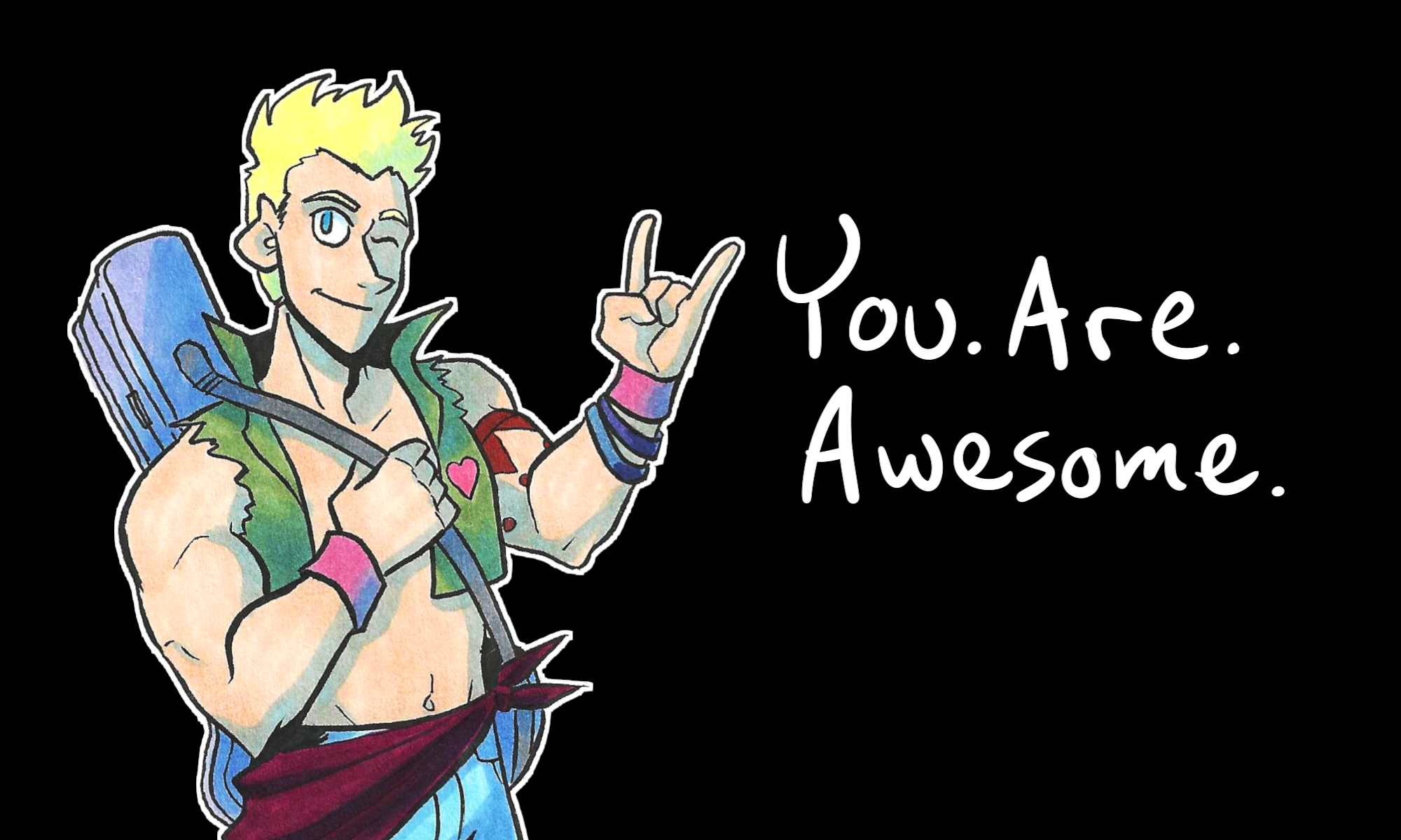
Are you an aspiring comic artist struggling with basic character design? Do you even know what the basics ARE?
Well, strap in and join me on this live stream! I’ll walk you through what I’ve learned in 8+ years of drawing comics. Plus, I’ll show you some of my favorite character designs in media.
“But I don’t have time to watch an entire archived live stream!” Well, I DO encourage you to set the time aside to watch this. But here are some important bullet points to keep in mind:
- The Silhouette Test – this is a tried and true method, and is even used by Disney’s animation team. Basically, does the silhouette of your character stand out in a lineup?
- Symbols – what symbology is present in your world? How does that affect the character? Do they wear colors or symbols that resonate with them?
- Contrast – If you’re designing multiple characters, how can you make them stand out from each other? Can you have different or complimentary colors to each character? What if one character styles their hair up, but the other lays it down? etc.
- Similarity – If you’re designing a team, how can you indicate that – but still have them stand apart from each other? What elements do they have in common? WHY are they in common?
- Simplify – when you draw comics, keep the design SIMPLE. You will be drawing these characters repeatedly. Don’t make it complicated or you will hate yourself.
- And finally… Be Open-Minded and Be Curious!
I hope this helps you on your creative journey. Thank you for watching and reading!
You. Are. Awesome.
