 I had heard recently that more peeps wanted me to talk more about works-in-progress here on the site, so I wanted to share this post.
The Legend of Jamie Roberts is just one comic I’m working on, but I’m at the point in development that I can come up with more solid ideas about character designs, monster designs, environments, and the like.
However, I needed to also distinguish something important in the narrative – the spiritual elements.
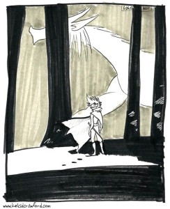
In The Legend of Jamie Roberts, there are two worlds: the physical world the characters live and interact in, and the spirit world that Jamie sees when she has prophetic dreams. The spirit world, called The Way (among other names), is full of flowing energy, monsters unseen in the physical world, and spirits with special jobs and appearances.
It’s easy to show the monsters and spirits, but I had to show the free-flowing energy in the spirit world. I found one of the best ways to do that – no panel borders.
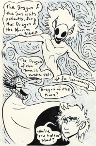
The scenes that happen in the physical world have solid panels with gutters (the white space between panels). The scenes in The Way won’t have that, to better show the free-flowing nature of the realm.
The other thing I wanted to test was what style of coloring I wanted to use. I definitely did NOT want to do digital coloring like with Johnson & Sir or Seeing Him.
Why?
Well, I needed to put a limitation on myself. Every project I do has a limit of some kind, whether it’s length or tools used. My comics colored via PhotoShop have a larger (possibly even infinite) color palette, but are limited by page numbers – I’ve never done such a project that has lasted more than 100 pages. The Legend of Jamie Roberts, in its current script, has close to 500 pages. I needed to limit myself in some way so I can produce the pages quickly, and PhotoShop is time-consuming.
So, I’m using the Validation method of coloring for The Legend of Jamie Roberts – the majority of it will be Copic markers, with digital colors for touch-ups and backgrounds (I’ve tried using markers for background colors, and it looks…unflattering. It bleeds in weird places around the figures and streaks too much).
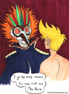
I still need to find other ways to visually distinguish the physical world and the spirit world via colors. I’ve done watercolor test pages and the results were…gross. The colors didn’t mix well and the palettes available were too limiting compared to what I wanted to achieve visually. So I will NOT be making this comic with watercolors.
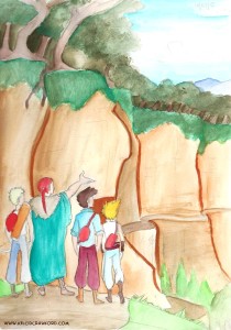
I doubt I’ll be using watercolors again outside of some spot illustrations or as a sketching tool.
So, Copic markers it is! I have a large selection of colors available to me, not to mention they’re the tools I’m most comfortable with (outside of charcoal, pencils, brush pens, fine line markers, and PhotoShop).
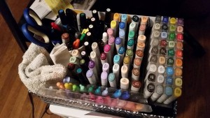
Although, knowing the tools I have at my disposal, I want to do some test pages for some other comics projects I have in mind…
That’s all for now. I gotta’ get back to the drawing board.
Thank you for reading!
You. Are. Awesome.
