“Character Design” is generally something you hear more in the animation industry than the comics industry. However, the two industries often overlap, especially whether you talk about camera angles, lighting and moods, or, in today’s post, character design.
Character design is especially important in comics. You need characters that…
- express the full range of human emotions,
- are visually individual from each other, and
- embody necessary elements in your story.
On top of all of this, the character design should be simple enough that you can draw it repeatedly and NOT want to stab your eyes out with a mechanical pencil.
So before I show my own character designs and what elements I think work, I’m going to show some things that…don’t.
While there are no hard and steady rules for character design, I have this one personal rule of my own. It’s the only one I need, but it’s no less important.
If it makes a gorgeous illustration, it’s a terrible choice for a comics character design.
This is something mentioned briefly in an Aaron Diaz blog post about costumes in character design, under a section called “Simplicity.” He says…
Above all else, keep it simple. Comic characters are not pin-ups or other illustrations; you have to draw them over and over again, from various angles. If you pile on too much detail, you’ll wear yourself out slogging through all the bits every time you have to draw them.
Let’s look at an example…

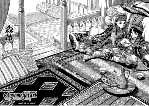
THAT is a beautiful illustration. It would be a total pain in the ass to draw repeatedly for a comics story.
Now, I know what you’re thinking: A Bride’s Story.

Yes, it is insanely detailed and gorgeous. The artist also has assistants to help her meet her deadlines.
Most comics artists I know don’t have the luxury of an assistant to help them make art. They are, 99% of the time, making everything on their own.
To that end, I still stand by my personal rule.
If it makes a gorgeous illustration, it’s a terrible choice for a comics character design.
Remember that simplicity is key.
So, what else doesn’t work?
Same Face Syndrome.

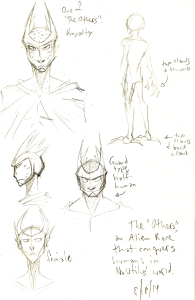
Same Face Syndrome is when you use the same face in your character design. The most cancerous of Same Face Syndrome symptoms spread into the physique, when you draw all of your characters with the same general body shape.
I used to suffer from this HARD when I started out. It’s a common mistake because Same Face Syndrome is so formulaic, and formulas help make new work faster…even if it’s not necessarily better.
The thing about character design is it should not be formulaic. Your characters should not fit a mold.
They should be individuals, with their own physiques and faces and personalities.
Each character you draw is their own person. They should serve a unique but specific purpose in your story. That’s why you draw them into your comics, after all.
Have you noticed any Same Face Syndrome elsewhere? Have any tips for character designs? Leave them in the comments!
Thank you for reading and I’ll see you tomorrow, when I show some of my own character designs and the creative decisions behind their looks.
