Coming This Week…The Sticker of the Month Club!

A selection of stickers for the Sticker of the Month club.

Thank you to the fans on the latest livestream for helping to come up with this idea. Coming soon, (like, if all goes well, this should launch on July 2), the Sticker of the Month Club!

See, after that livestream, I had the thought, “Stickers were super popular at the Mini Pop-Up Event. Why not a Sticker of the Month Club?”

I did the math, and once I did, I thought, “HOLY BANANA PANTS, WHY DIDN’T THIS HAPPEN SOONER?”

Here’s what I want to do:

Each month, subscribers get a sticker in their mailboxes, along with a personalized thank-you note.

The cost? $10 a month for subscribers. That $10 will cover the sticker AND shipping/handling. (This price point is for USA patrons. There will be a separate tier for internationals). Subscribers also get access to my Tiny Dinos Discord server and shout-outs in the credits for KickStarter projects.

For fans who already give $10+ per month through Ko-Fi... Well good news! I can add you automatically to the Sticker of the Month Club if you’re interested! No need to go to a separate site to pledge.

My goals with the Sticker of the Month Club are:

  • to offer something cool and different to subscribers,
  • to engage with folks in a unique way,
  • to have new offerings at convention and author appearances,
  • to have another source of income so I don’t have to do (so many?) DoorDash shifts.

Now, let me answer some other questions:

Some folks had originally pitched a “T-shirt of the month club,” because another artist had some success with it. I want to address that real quick by saying: First, everyone and their brother does a T-shirt business. They’re oversaturated. To the point that a business educator told me once, “Don’t go into T-shirts.” I’d like to do something that stands out instead.

Also, T-shirts are not as environmentally sound as folks think they are. It takes a LOT of resources to make T-shirts, and despite the best efforts of lots of folks, most of them end up in landfills.

Not to mention, I live in a small apartment. I don’t have room to store extra shirts. And to folks who say, “Well, you could get a print-on-demand service to do it,” I’d rather not this time, for reasons I’ll get into in a second.

If you’re wondering, “Are you going to do the art AND the logistics?” Yes. I’ll make the art and mail these out to subscribers. I already have a printer for these stickers, because I’ve printed with them before and REALLY liked their quality and pricing. I also already track inventory for my convention appearances, so I’m comfortable with that step already. (Not to mention that I’m used to tracking customers – things that sound creepy, but aren’t – because of KickStarter reward fulfillment).

Plus, if I print extra stickers each month, I can post the remainder for sale on Ko-Fi and take them with me to conventions.

Should this idea EXPLODE, I’ll revisit this arrangement. But I’m comfortable with this idea. Right now, I don’t expect this Sticker of the Month Club to overtake The Legend of Jamie Roberts in popularity. I have the bandwidth to do both (especially since I don’t work at NeverEnding).

Excited? I hope so!

I’m announcing the official launch of the Sticker of the Month Club on my email newsletter when it’s ready, so if you want on board, go sign up to get the news first.

Like I said before, if you already give $10+ per month through Ko-Fi, I can add you to the Sticker of the Month Club automatically. Hit me up at kelcidcrawford@gmail.com if you want to sign up.

Broke? Share this news with your sticker-loving friends!

Got more questions? Let me know in the comments!

Thank you for reading.
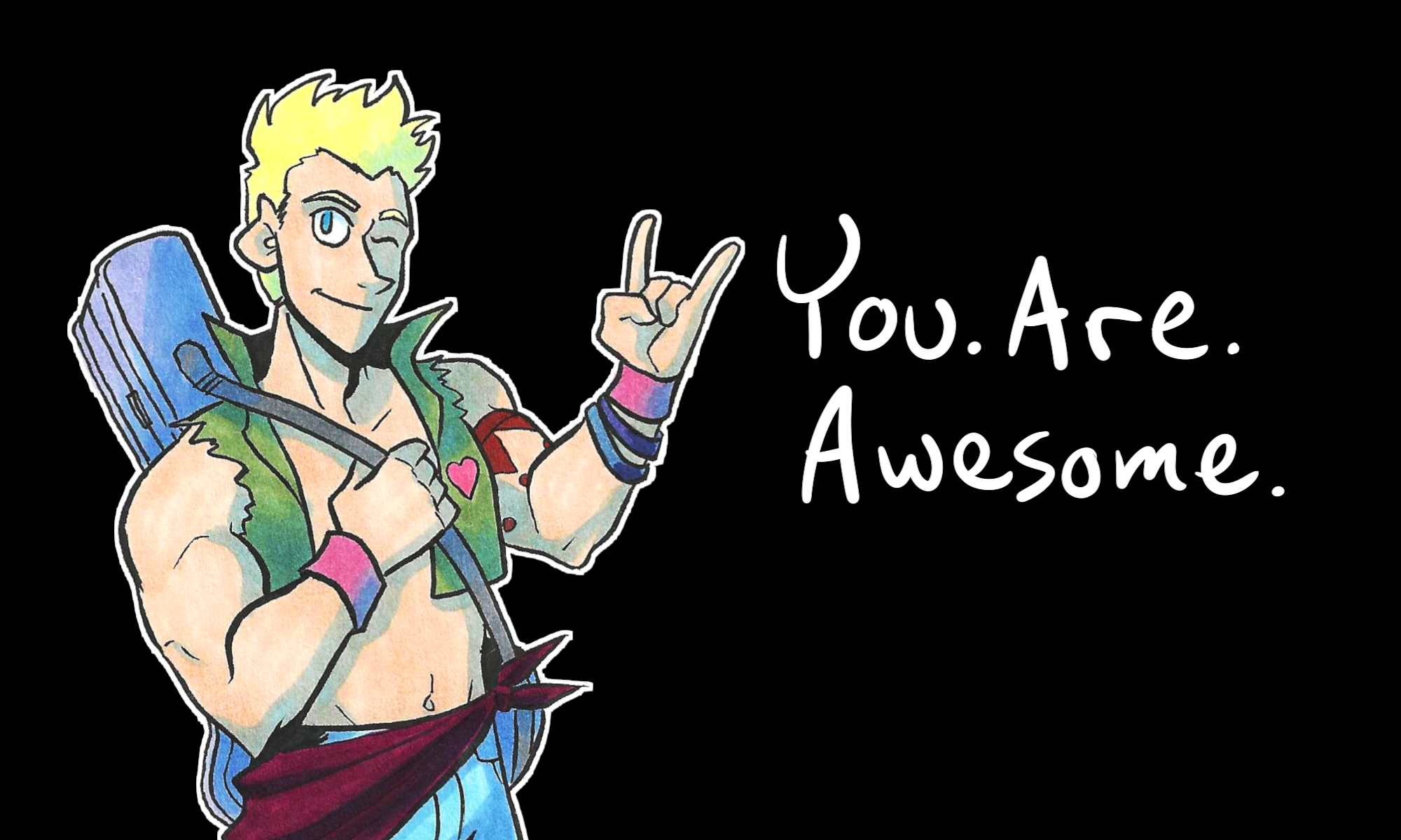
You. Are. Awesome.

My “Plump the Post” Zine Submission

an illustration of a plump transgender/nonbinary person holding a flower. Below them is a banner saying "liberation" and above them flies the genderqueer flag.

I can’t remember the exact year that Plump the Post happened. But I think it was no later than 2018.

Plump the Post was a zine collecting art made by and for fat representation. For my entry, I wanted to highlight chubby genderqueer people because they’re valid, too.

(Also Hollywood has a tendency that even IF they highlight trans characters, they’re, 99.9% of the time, skinny.)

The model who served as inspiration for this piece was a friend of a friend, a chubby trans dude whom I am not naming to protect his privacy.

Is the zine available for sale? Well, it’s here.

Will there be another issue? Hard to say.

But I’m glad I participated in it.

Writing for Comics 101 – Making Pages You Can Actually Read

In today’s lesson of Writing for Comics 101, let’s talk about making pages you can ACTUALLY read.

How do we do that? By not packing the pages with an obscene amount of dialogue.

Or at least, if you HAVE to keep so much dialogue, how to pace it out so it’s not a word brick.

This technique is something discussed in more detail in Making Comics by Scott McCloud, so what I’ll do for today’s post is share my mistakes so you can learn from them.

Let’s take a look at this page from Seeing Him, written by Kia Crawford and drawn by me:

seeing him transgender webcomic page 25

To be honest, there’s a way to get the information across that we need, without using a fuck-ton of dialogue.

We could:

  • split this between two pages,
  • condense the banter,
  • condense the backstory drop,
  • change the page layout,
  • change the balloon layout,
  • or any combination of these.

At least past me had the sense to split the dialogue into separate balloons. That way the page felt, at the time, a little less like a word brick.

This is me spit-balling some ideas right now on how to fix this page of Seeing Him: we could change the camera focus in the second and third panels, to cut away to framed photos on the walls. Those photos could showcase the history of the venue. With that edit, we can split the dialogue up some more, re-frame where the speech balloons sit, and make the page feel like less of a collection of talking heads.

Compare this page to The Legend of Jamie Roberts, page 65, written and drawn by me.

the legend of jamie roberts genderqueer lgbtq pirate adventure webcomic page 65

Here, I let the space breathe and tell the story for me, without so many words.

Whether you can draw or not, comics are a visual medium. Let the environment and scenery describe for you what words could not.

If you have questions, or need feedback, let me know in the comments. I’m happy to help.

That’s all for now. Thank you for reading!

You. Are. Awesome.

Writing for Comics 101 – Why One-Liners Are Not Enough

In today’s installment of Writing for Comics 101, let’s talk about why one-liners are not enough.

If you missed it, I wrote in last week’s installment about how to write good characters. Now, I’m going to let you in on a secret about how to write dialogue for characters:

YOU CANNOT FORCE A ONE-LINER.

Admittedly, this is more of a problem I see in people who want to get into superhero or shonen comics. Both genres are guilty of having characters talking (almost incessantly) on the pages during action scenes. This incessant talking is meant to lead into quote-worthy one-liners.

Don’t get me wrong. I love one-liners. Otherwise I would not love the movie Mystery Men as much as I do.

But here’s the secret about one-liners: They are rooted in the characters.

To have good one-liners, you need to have good characters. To have good characters, you need to know your characters REALLY well. As in, you should know the things I talked about last week. If you don’t, go back to the Word document.

But a story cannot be made of one-liners alone. You need to have connective moments. Even Mystery Men knew that.

So what you need to learn is how to write actual, believable dialogue between characters.

To make that actual, believable dialogue, you need to understand your characters backgrounds, wants, and fears.

And here’s the most important secret about making comics that few people talk about:

Sometimes, the best thing you can say on the comic page…is nothing.

Trust me: silence can say more in a story than any amount of dialogue ever could. Read Cairo and Asterios Polyp if you don’t believe me.

If you still have questions, let me know in the comments. I’m happy to help.

That’s all for now. Thank you for reading!

You. Are. Awesome.

Throwback Thursday – Phoenix

x-men phoenix marker and ink sketch from 2013

Today’s Throwback Thursday is going to reveal how much of an absolute hipster I am. Because here’s why I drew Phoenix from X-Men:

I’ve never read the comics that featured Phoenix. I only ever saw X-Men 3 for context for who Phoenix is. (And looking back on it, X-Men 3 wasn’t that good).

I drew Phoenix because of the aesthetic.

I wanted to play around with shadows and light on a superhero figure, and this sketch was the result. This was drawn back in 2013, so I’ve improved since then.

But yep – I’m a freakin’ hipster. Only hipsters would draw a character because they looked cool, not because of anything actually pertaining to the character.

So please forgive 2013 me.

Still, I wanted to share this so a) you could learn from my mistake, and b) because I’m actually pretty pleased with how this sketch came out.

If I ever do a redraw of this, I would change the character to someone whom I actually know and like.