It’s not yet New Years, but I wanted to talk about this early. That way I’m not too lost in the flood of New Years’ Goals posts that are sure to flood across the internet.
Sure, I have goals for 2015. There are personal ones like walk everyday, send more cards, that kind of thing.
But this blog post is being made to share the goals for my comics in 2015.
Why am I sharing them?
Because I want you to hold me accountable.
In sharing my goals with you, I hope that you can keep me on the right track, so I don’t lose my way, so I can succeed, and not back out of promises I made to you.
In return, I hope to hear about your New Years resolutions in the comments. So that way, I can help you do the same!
So, for 2015, I have a list. A list of things I wanted to accomplish. These things are…
- Publish more books,
- Update this blog more often,
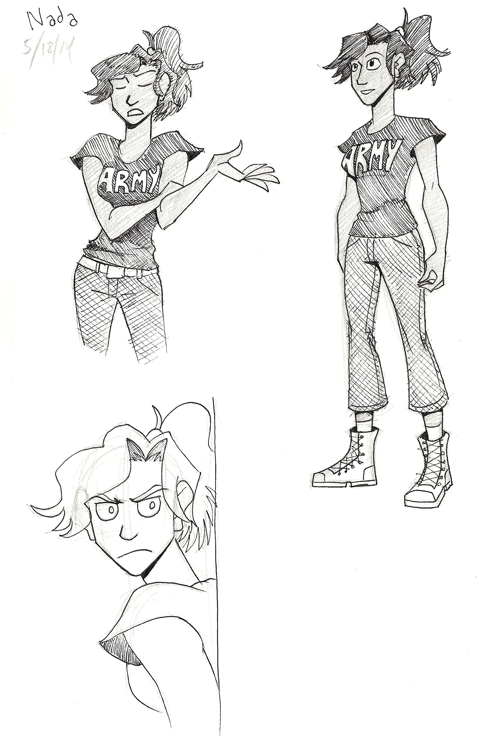
- Revive the Women Warriors Project,
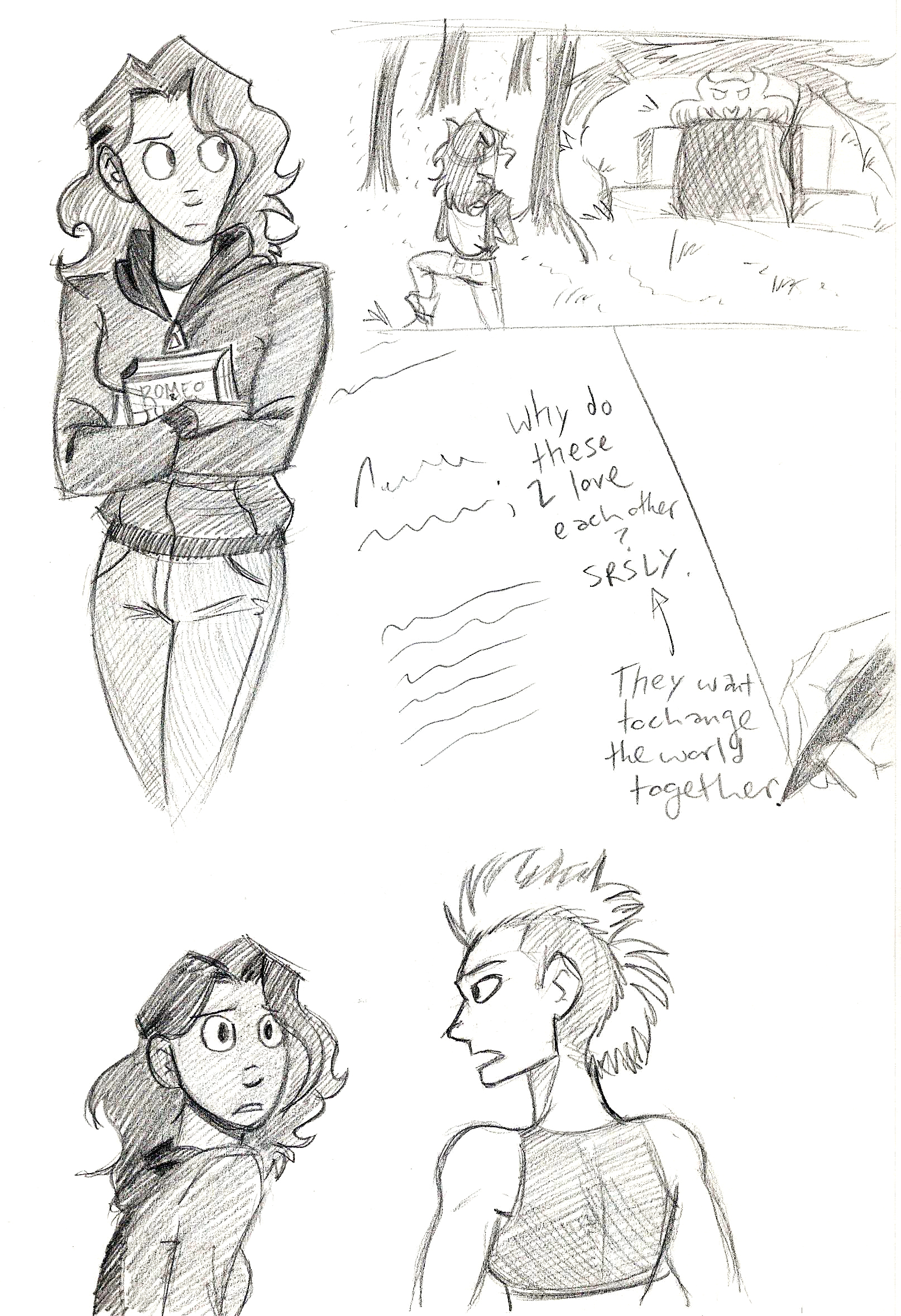
- Script my Swan Lake story,
- Finish the script for The Legend of Jamie Roberts,
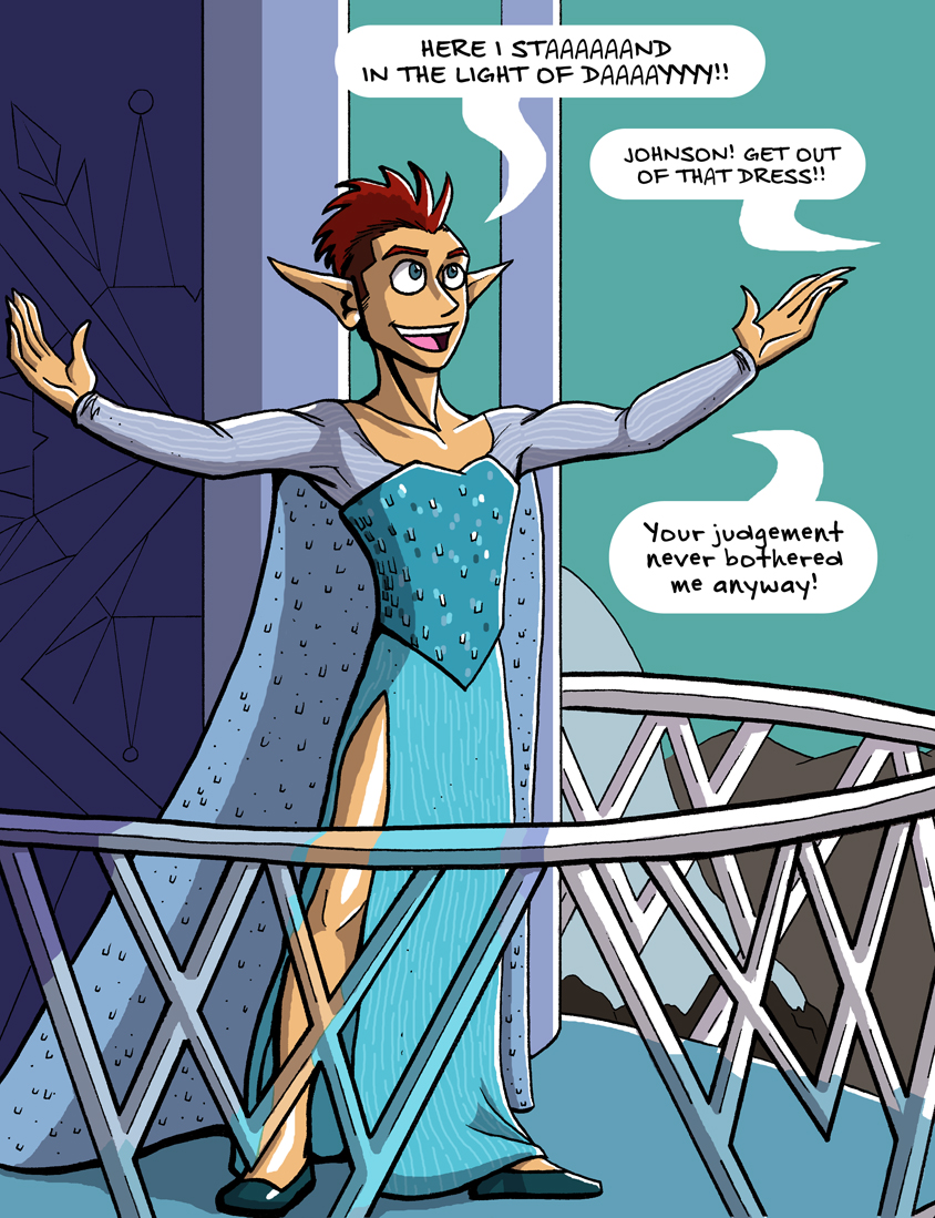
- Finish Johnson & Sir.
- Grow the amount I earn from selling art.
- Update my YouTube channel more often.
Of course, a lot of those goals are not specific. So I broke them down into do-able chunks and came up with…
- Write every day,
- Publish 1 new eBook a month,
- Finish 1 new painting a month,
- Post 4 items on Storenvy every month,
Breaking it down even further, I have goals for every week and even every day! They are…
- Write 1000 words a day,
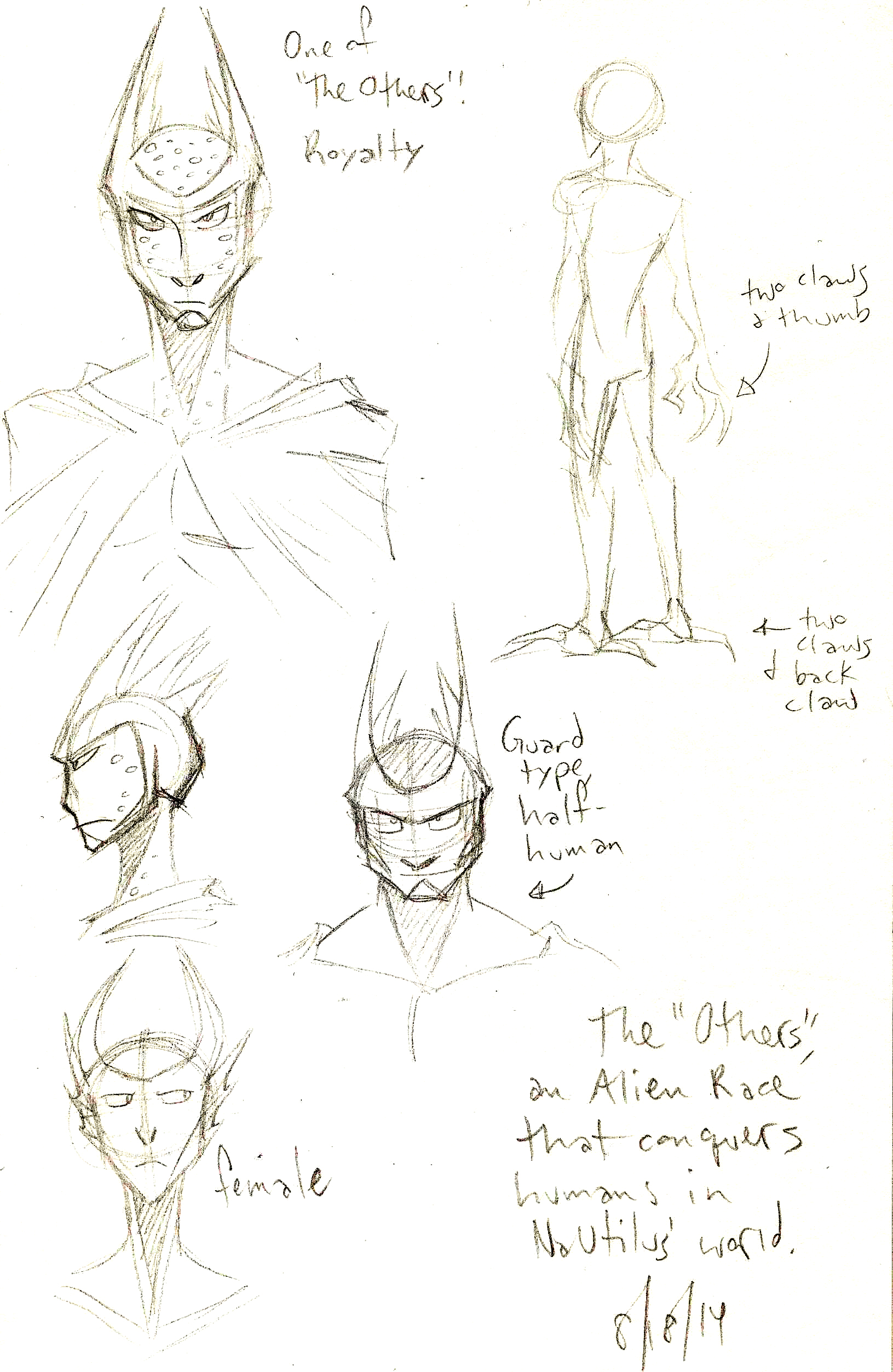
- Draw 2 Sketchbook pages a day,
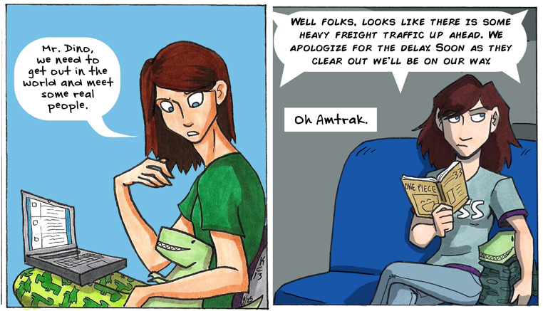
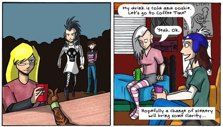
- Finish 1 new mini-comic a week,
- Post 1 new item on Storenvy a week,
- Update this blog Monday through Friday
To help me keep track of my daily goals, I borrowed from Karen Kavett and Charlie McDonnell (and Jerry Seinfeld) by printing up copies of the Don’t Break the Chain calendar.
The idea of this calendar is that you have a goal to accomplish everyday. Every day you do the thing, you check off the day on the calendar. Do it everyday and you start a chain of check marks, so don’t break the chain!
One of my big goals is to update this blog Monday through Friday. That will start January 1, 2015, this Thursday.
I actually tied a few goals together for 2015: I intend on reviving the Women Warriors Project by making one new painting every month for it. By finishing 1 new mini-comic every week, I’m making one new item to sell on Storenvy every week. By sketching 2 pages everyday, I’m making content for eBooks I’m publishing every month. When I finish a sketchbook, I’ll make a video and upload it to YouTube.
I like combining goals. It makes accomplishing them more fulfilling.
What are your goals for 2015? Let me know in the comments!
Thank you for reading, and I’ll see you on Thursday.