I don’t usually update on Mondays, but when I do, it’s for a friend.
Chloe Rose is not only a good friend, but a fabulous artist. So maybe consider this a bonus Favorite Artist Friday…on a Monday?
Anyway, to Chloe’s work, because it’s worth talking about.
Chloe made this piece for the recent Toledo Art Walk.
She doesn’t have any webcomics out (yet), but the things she would perhaps be best known for are her fanart (on her Tumblr) and her concepts for her original work, Queen’s Heart.
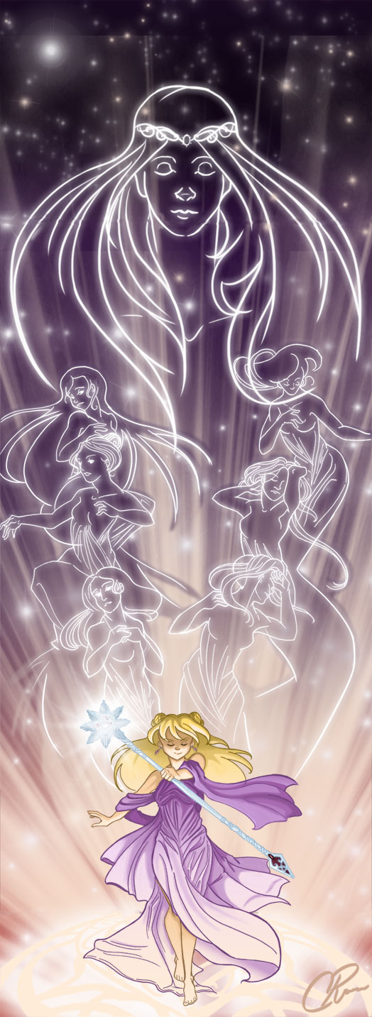
For example, this is perhaps one of my favorite things she’s done with Queen’s Heart.
Yes, it’s unusually large, but look at it! The colors, the amazing lighting, the visual effects, all of it is still stunning. This was originally made to be a three- to four-foot tall poster as part of a show she exhibited at, and you can see why it needed to be so large: the dichromatic colors and the intense lighting demands to be seen on a larger scale.
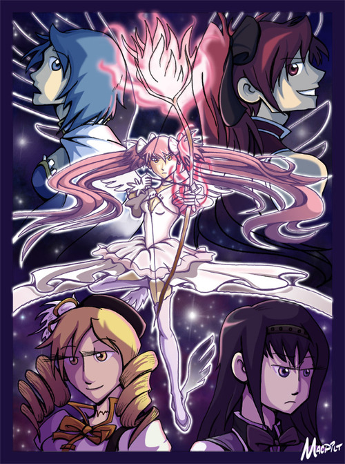
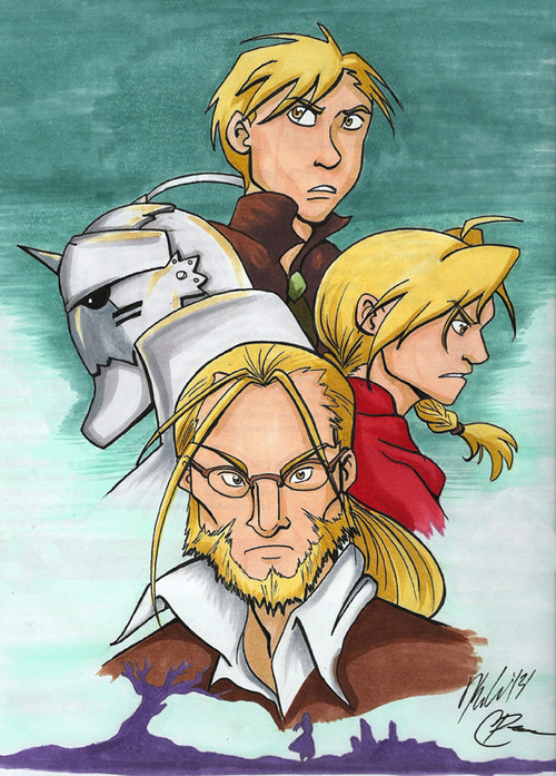
Chloe and I actually did a few pieces together, as part of our doujinshi circle called “MACPILT.”
We’re both huge fans of Puella Magi Madoka Magica and Fullmetal Alchemist: Brotherhood, and we wanted to make our tributes to such great characters, stories, and art.
While she does great work with character design and line quality, her best strength (in my mind) is her use of color.
Do you see the Madoka Magika piece above? With the five girls illustrated? That’s Chloe’s mad coloring skills at play. And she has only gotten better since then.
This lady knows how to blend colors, how to design characters with colors that highlight their personalities, how to make light and shadows mix well, and how to use color to show mood. She’s even taught me a few Photoshop tips and tricks, and flipping through her sketchbook always makes me try harder to use color.
She updates her art mostly on her Tumblr nowadays, so if you haven’t seen her other work, you should. She also recently got a Facebook page.
She’s also getting ready to go to grad school, starting this quarter. So, to help fund the effort, you can get either of the MACPILT prints by going to my online store. For September only, all sales from either of these prints will go straight to Chloe, to help pay for classes and things. After that the sales are split evenly between the both of us.
Thanks for reading! And I’ll see you all tomorrow, where I review one of the comics I got from Interventioncon.
This post isn’t about the technical bits of how I make comics. I already talked about that in my step-by-step guide to making Johnson & Sir, and I also made one for Validation.
That’s not to mention the many tutorials online showing how to make comics, or the exercises in “Making Comics” by Scott McCloud or any number of books and classes that teach you the technical aspects of making comics.
Believe it or not, artists are very technical people.
There’s nothing wrong with that, but it’s not what I want to talk about today.
Today I want to answer a question-ish thing someone asked me via email recently.
The Question-ish thing goes:
I would be interested to know how you, as a cartoonist, work, or think about work.
The truth is, I don’t really think about work all that often.
Let me explain.
I am a creature of habit.
I have particular places where things go, how things are put into order, and I have a routine established for every day and every week.
I am super organized.
I set up routines so I don’t have to expend energy thinking of where everything is or what I have to do.
I can put all of my energy on making art.
Does that mean that comics-making and art are made into a routine?
Yes.
In fact, my usual daily routine looks a little like this:
Wake up, shower
breakfast, make coffee or tea (depending on how much caffeine I need and what I’m craving)
sketch a warm-up piece
make comics
break for lunch
make more comics
done making comics, go to dinner
hang out with family
(sometimes) get writing done
BED!
There are changes sometimes. Like this week I ended my day before lunch and spent more time with my family. Playing board games, watching movies, what have you.
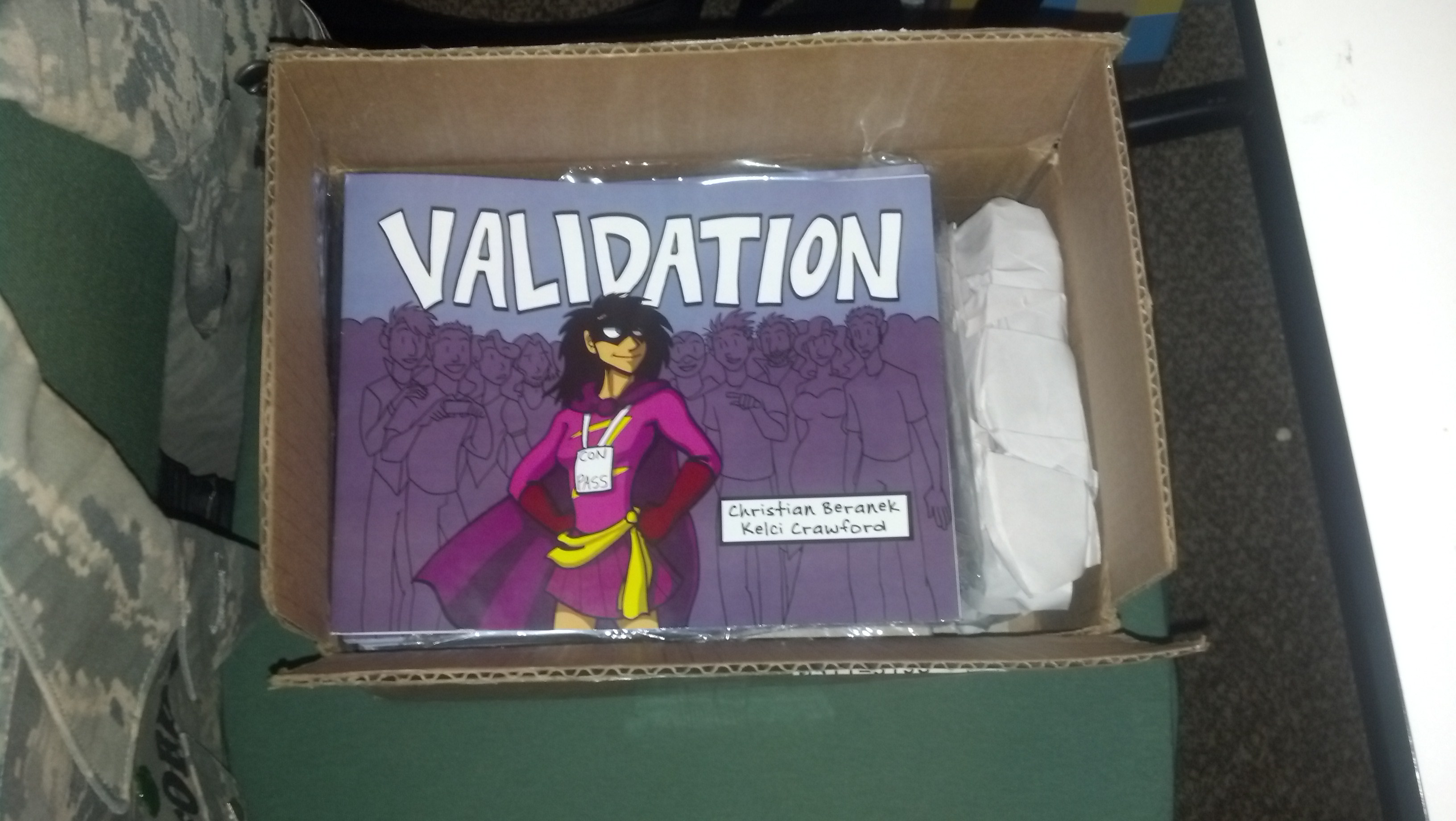
Last time I spoke about How I Make Johnson & Sir. Today I want to show how I make a comic strip for Validation, the other webcomic I work on, because the process is a little different.
If you ever get lost in the technical bits (especially in the Photoshop section), I explain some of those steps in How I Make Johnson & Sir so hopefully the techno-lingo won’t be so confusing.
I don’t (really) write Validation. Christian does (though we often talk story ideas over). I wait for her to send the script over to me first, and then…
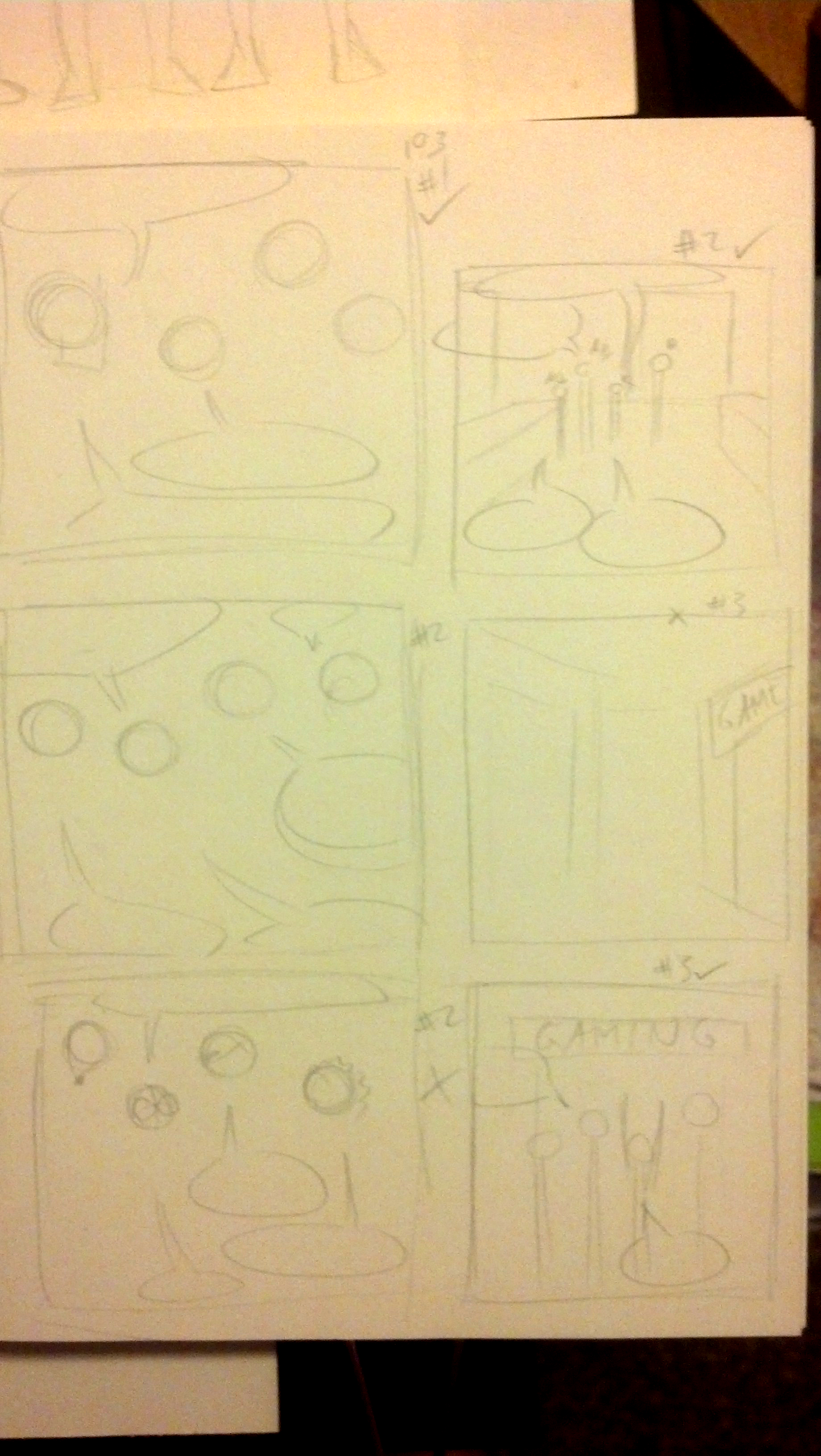
Step 2: Layouts
Sometimes I skip this step, depending on how simple or complex the strips are in the script. Since I work in three panels, it’s important to know where characters will be placed and where speech balloons will go, to make the strip as readable as possible. That way it won’t be so cluttered.
I did not do layouts for strip #105 because it was scripted in a pretty straightforward way, and I had an idea for how I wanted the strip to look.
However, I’ll show the layouts I did for #103, which had some weird camera angles.
click to enlarge
Step 3: Ready the Paper
I tend to do this step ahead of time. Thankfully I can get two strips from a single sheet of 9 inch by 12 inch Strathmore Bristol Vellum, which is my paper of choice for Validation. I trim the paper (to make it easier to fit on my scanner) and I’m good to go.
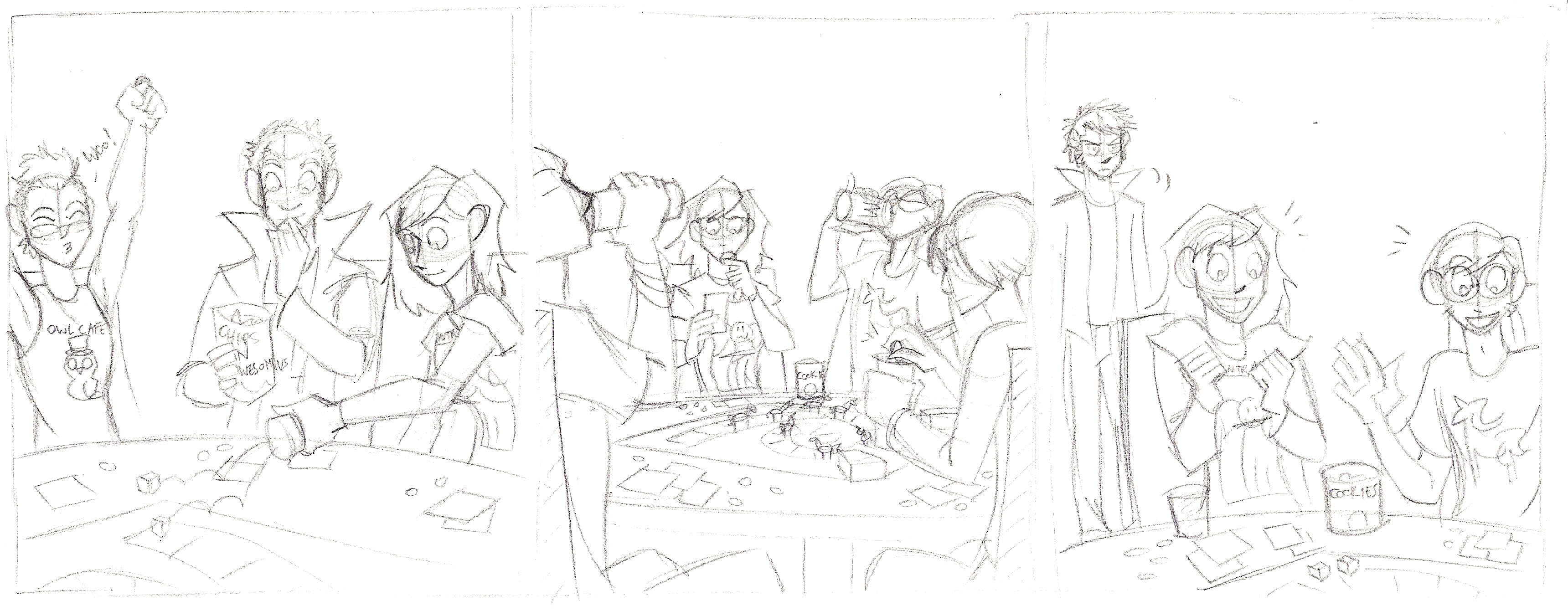
Step 4: Pencil the Strip
click to enlarge
Pretty straightforward. Although, if you notice two extra characters, one looks like me and one looks like my boyfriend. Fun fact!
When that’s done, I send the pencils to Christian (via DropBox) for approval. This is where any changes that need made can be done, though 99.9% of the time she gives the ok.
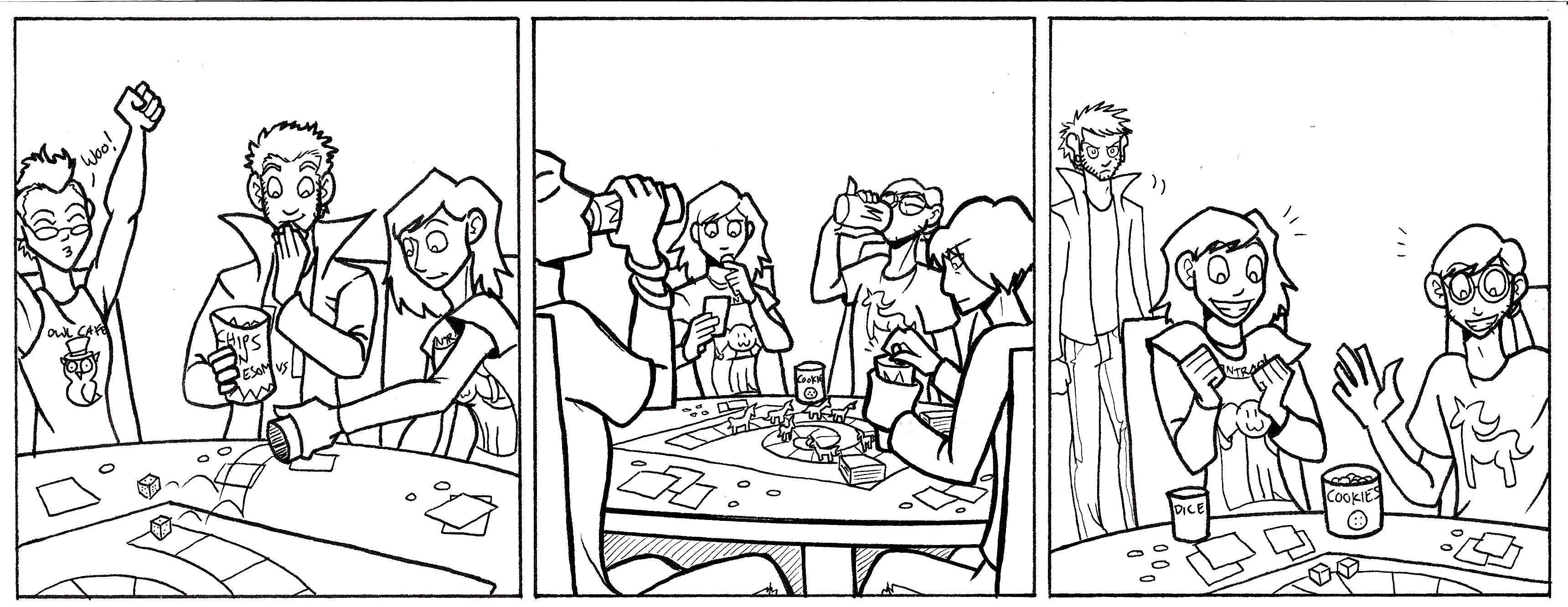
Step 5: Ink
click to enlarge
Once I get the ok, I ink!
To add a little depth, especially in panel 2, I made the foreground figures in thicker lines to make them pop more. I used a micron pen with a 1.0 width. The background figure in Panel 3 was drawn mostly with 0.5 and 0.3 width pens, with finer details in a 0.1 width micron pen.
Step 6: Color with Markers
My markers of choice are (from most preferred to least)…
Copic markers
Prismacolor markers
Sharpies
I used to do the entire comic in marker, but now I only do half. Sometimes it’s because a marker died, the markers will not blend well for the background, or I need a color I don’t have a marker for. So I just color what I can.
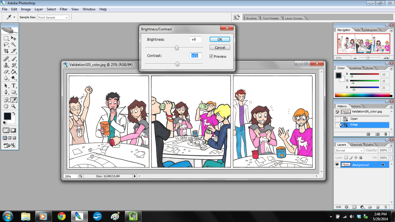
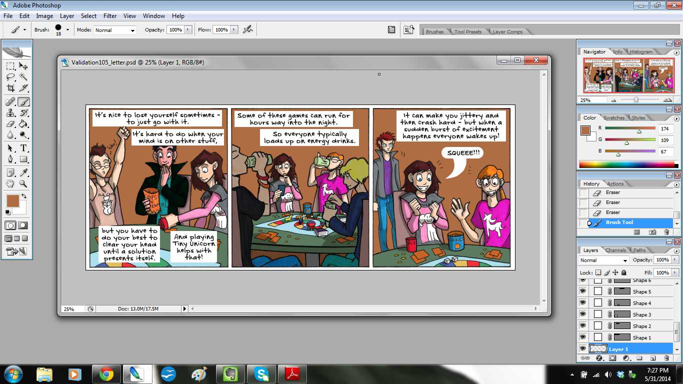
Step 7: Scan and Tweak in Photoshop
click to enlarge
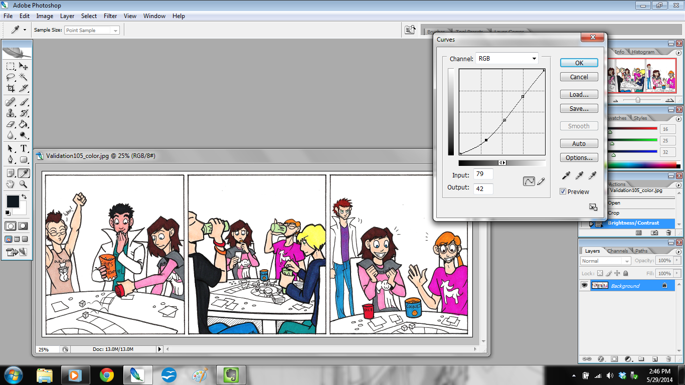
Once marker coloring is done, I scan the strip in at 300 dpi (dots per inch) and open it in Photoshop. The first thing I do is adjust the brightness and contrast (shown in the above picture). That way the strip isn’t so dim. Then I adjust the curves.
click to enlarge
Doing this will let the colors really pop.
Once those adjustments are done, I make a new layer in Photoshop and call it “EDITS”. This is the layer where I correct color errors I made with the markers, fix any wonky lines, and clean up smudges and spots.
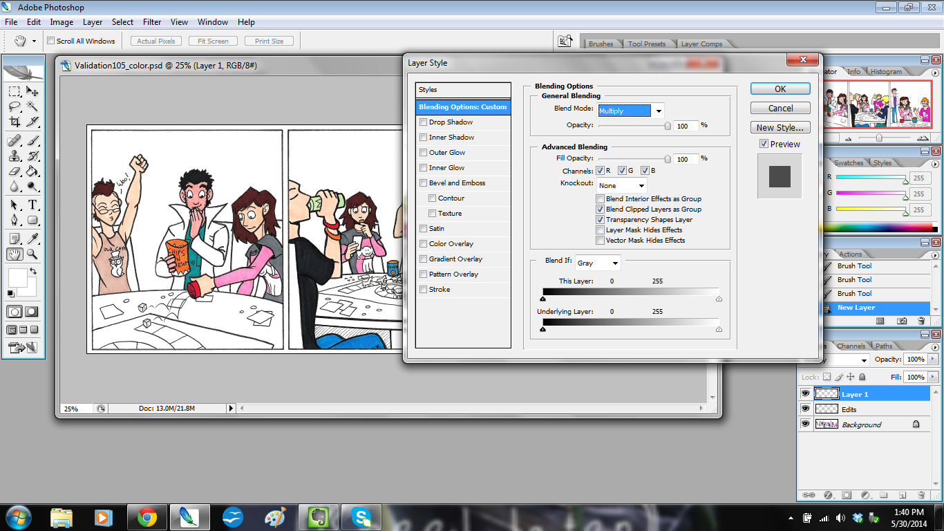
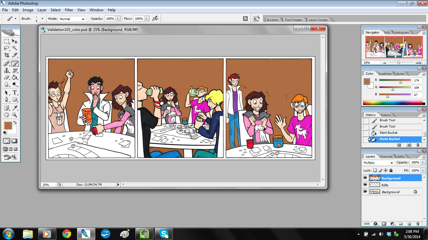
Step 8: Color the Background
Then I make another new layer on top of that and call it “BACKGROUND”, because here’s where I add background color.
click to enlarge
If you notice, I adjusted the blending options for this layer. For “EDITS” I left those settings alone, but with “BACKGROUND” I set it to Color Mode: “Multiply” at a Fill Opacity of 100%.
The reason I do this is because Multiply mode actually keeps the lines clean while still coloring. It works like this:
Rather than it looking flat and gross like this:
Then I just color in the background colors as needed.
click to enlarge
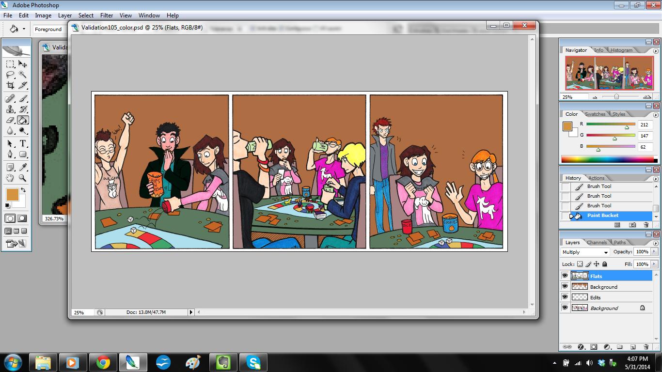
Step 9: Color the Rest.
Once backgrounds are done, I make yet another layer on top and call that “FLATS.” I also set this layer to Color Mode: Multiply and Fill Opacity at 100%. This is where I color in the things my markers missed, like Jim’s coat and the game table.
click to enlarge
…Sometimes I have another file open to reference for color.
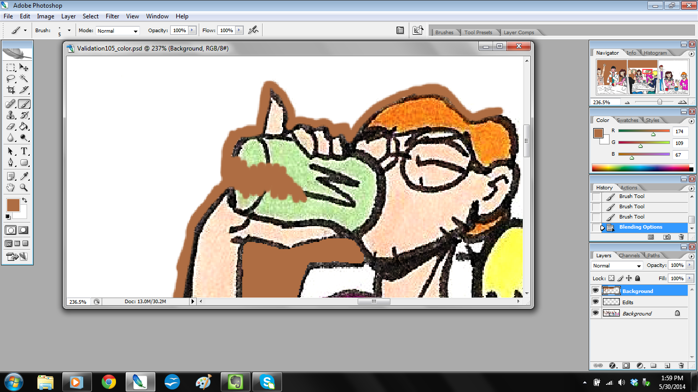
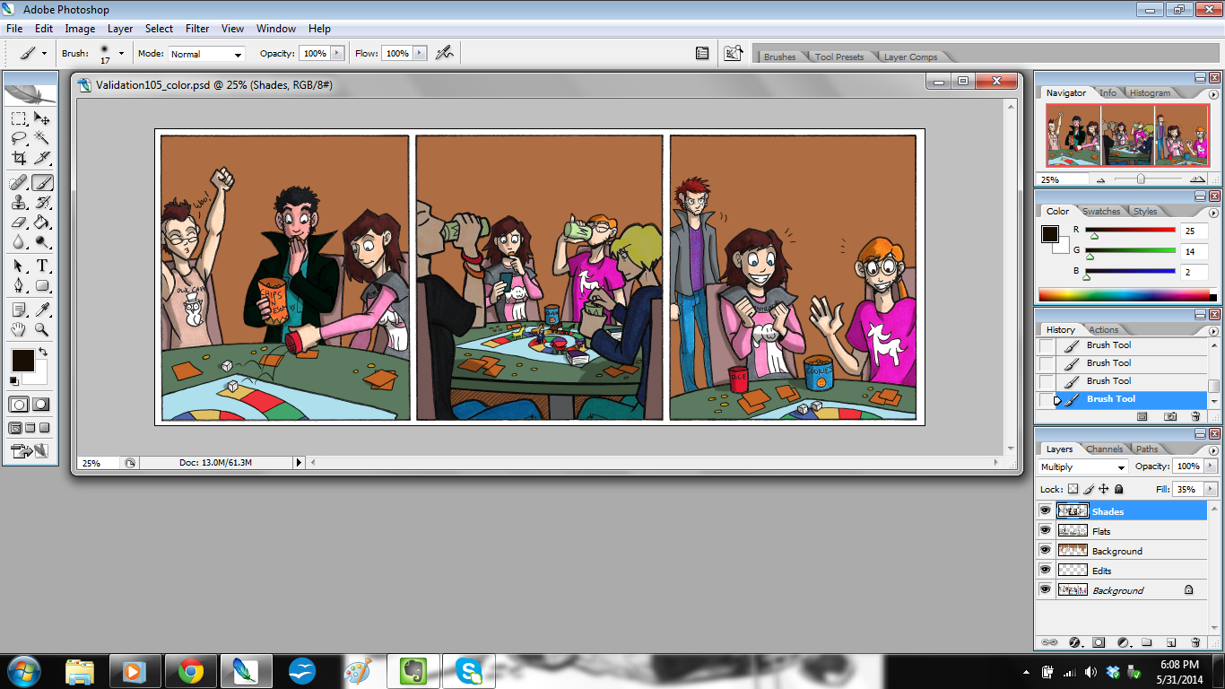
Step 10: Color the Shadows
This step is one I talked about a little bit in my previous tutorial, but here you’ll really see it in action.
I make a new layer on top, call it “SHADES,” and then set to Color Mode: Multiply and – here’s the surprise – Fill Opacity at 35%.
Notice it’s not at 100%? That’s because I don’t want the shadows to be overpowering. I also want the color of the shadows to blend, instead of getting any weird effects that would happen if I changed the paint brush opacity (yes, you can do that).
Once I do that, I color the shadows in, and it looks like this.
click to enlarge
I did something a bit unusual in Panel 2: I put the two figures closest to the reader in shadow. I did this to frame the picture and keep the focus on Ally and Kyle.
So now the colors are done! I save the file, and then flatten the image so all the layers merge. Then I make another new layer and save the file for lettering.
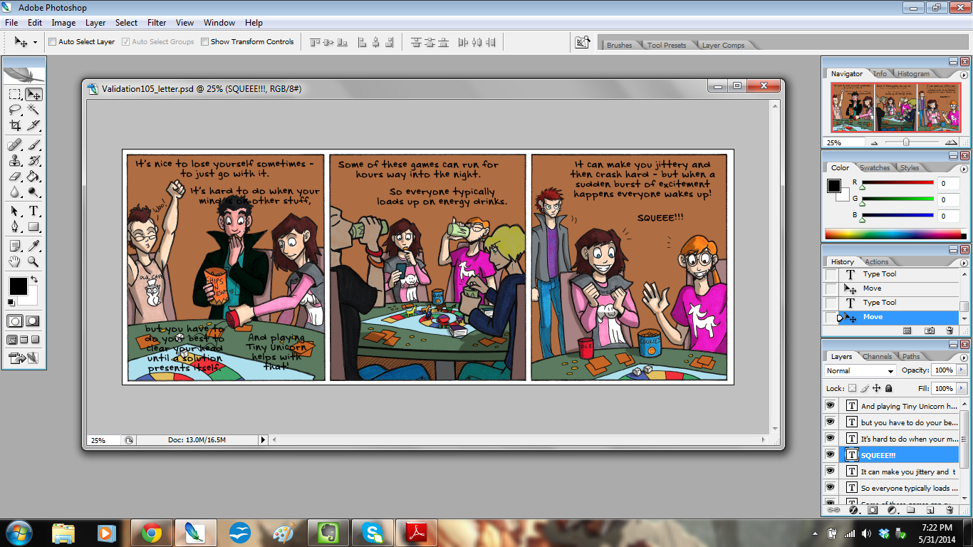
Step 11: Write the dialogue
For this step, I have the open file of the script handy so I can refer to it.
Then I write the dialogue and captions.
click to enlarge
I try to arrange them in such a way that they won’t block too much of the art, and to ensure it can be read easily.
Then, once everything is written and checked for spelling, I get to the bottom layer, make a new layer, and start placing the balloons and boxes with the rectangle tool.
click to enlarge
I use the rounded rectangle for dialogue and the plain rectangle for narration.
To make the tail for that balloon, I got to the bottom layer again, made a new layer, and painted it in.
Once all of that is done, I merge the layers to flatten it out, and then…
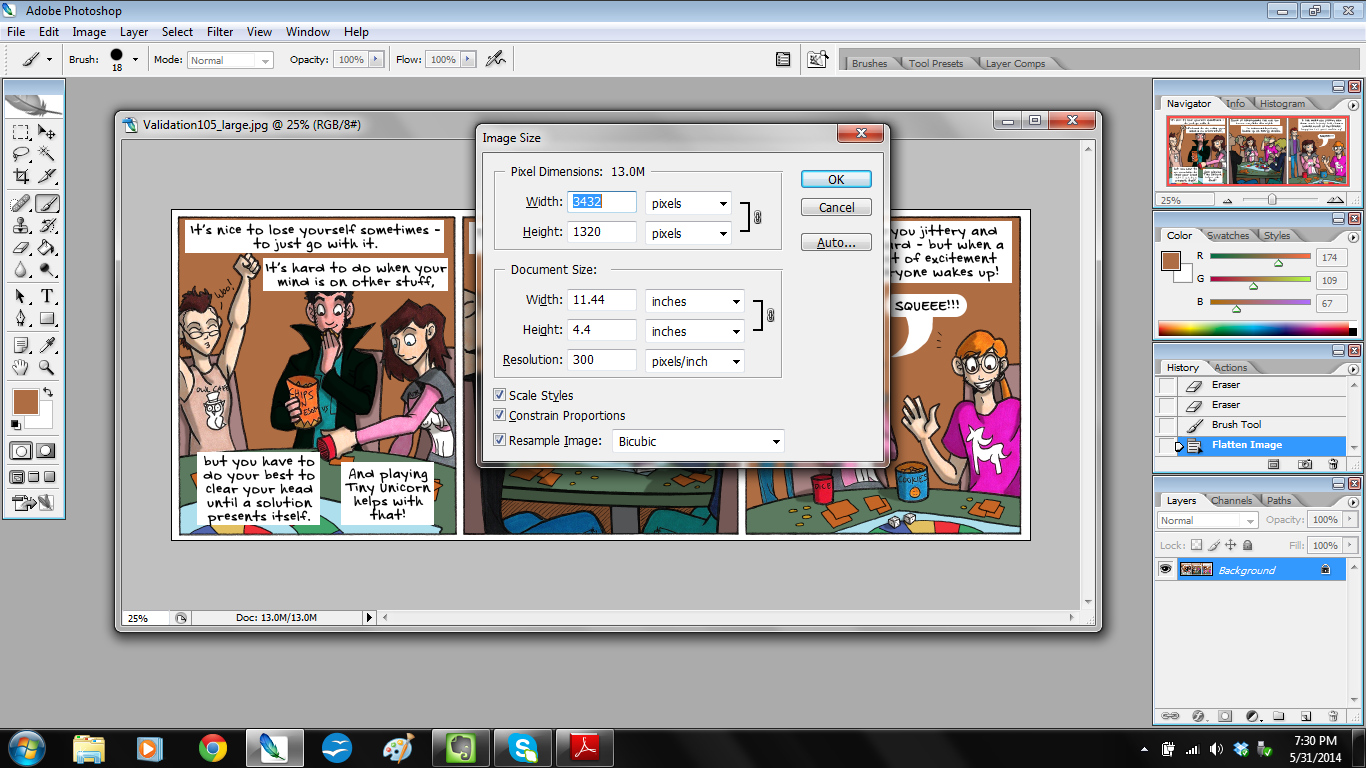
Step 12: Save the File!
I save it first at its current size and call the file “Validation105_large.”
Then I adjust the image size.
click to enlarge
The large file is at 300 dpi, which is the right size for print, but it isn’t too web-friendly. So to make it nice and tidy for the website, I shrink it from 300 dpi to 100 dpi. And I save that file as “Validation105_small.”
I send the finished strips to Christian via DropBox, and shazam! I’m done!
I hope you enjoyed looking at my process, and I hope you found something useful from it!
Something tells me that I’m going to be making an entire comic (or two) with this most marvelous of tools: the brush pen.
A Sakura Pigma archival ink brush pen, to be more precise.
Now if only they work with Prismacolor markers…
OH WAIT…
Click for larger image.
THEY DO.
I think I’ll be using this type of pen to draw Charlie & Clow AND The Legend of Jamie Roberts.
I love the free flow of the brush pen, and it’s much more controlled than a paint brush, plus it keeps a better ink flow.
That’s my least favorite thing about working with paint brush and India ink: the ink sputters and turns grey JUST as you start to get into a groove.
I don’t want to interrupt my groove! I want to draw!
Thankfully the brush pen doesn’t do that because 1. it has its own ink well built in, and 2. it’s way more confident than the wimpy paint brush. The brush pen could totally beat up the paint brush and steal its cookies.
With all of that said, I’ll definitely be redrawing what few Charlie & Clow pages I have inked.
But uh…
Charlie & Clow, page 1, still in progress. Click to enlarge.
…Oh boy that’ll be a pain to redo.
I love you, city-scapes, but you are a right pain to draw, much less re-draw.
Right now you might be thinking, “No! You don’t have to do it over again! Save yourself the effort!”
I’m going to anyway. I HATE how the cross-hatching turned out on this page. It’s messy, it ruins the skin complexions I’m trying to illustrate, and it’s way too time-consuming. (And in comics, you need every minute you can scrounge up).
I’m going to redraw it with brush pen, and grey markers for tones. That, and Charlie needs a slight costume change.